Fresh starts
Like many designers I began my career in CMYK, infatuated with grids and typography and the complexities and constraints of print design. But I swapped paper for pixels when I joined Hostelworld’s Product team in 2013, and quickly found myself becoming obsessed with websites and apps as I channelled my design expertise into digital products. After about a year of coding emails and designing for a range of departments across the company, I was invited to a meeting with our Android team.
We had a great app that people all over the world enjoyed using. Its primary function was to help people book hostels, and it had helped millions of travellers do that, but feature requests were pouring in from customers, and as the team worked to keep up, new functionality was being shoehorned into outdated layouts. Before long the app felt bloated and a design overhaul was needed. I’d never worked on any mobile apps, but Google’s material design had caught my eye and I was poring over the guidelines for their sheer beauty and ingenuity. So I jumped at the opportunity to redesign the Android app using the material framework.
Around the same time, Hostelworld was undergoing a rebrand. This helped to distil what we’re all about — hostelling and the unique social experience it offers — and how to best present it to our increasingly mobile, dominantly millennial audience. With stacks of research from Play Store reviews to survey feedback and user testing, we had some idea of what people loved and which features they found confusing or frustrating as we started planning the material redesign.
Post-rebrand, our product screens online were transformed and we ditched the bunk bed logo for something fresher. 🍊
The Challenge
Armed with a shiny new brand, our main goal for redesigning the app was to deliver a fresher and ultimately more useable product, taking advantage of all that material could offer while giving our brand a voice. Our core functionality was to remain the same:
- Browse hostels and save for later
- Filter by price, reviews and location
- Choose, book and pay with ease
- Easily manage multiple bookings
With this in mind, I began deconstructing the app, getting to grips with the booking flow and the visual language we were using. Initially I was quite tentative, examining minor details and trusting that everything was in place for a reason, so it was best not to interfere too much. But as I gained confidence it became apparent there were some fundamental issues with the flow, so I ditched the safety net of the existing designs and started from scratch on pen and paper. I found it really useful to work from a clean slate as it forced me to consider each screen as a whole rather than a group of distinct elements.
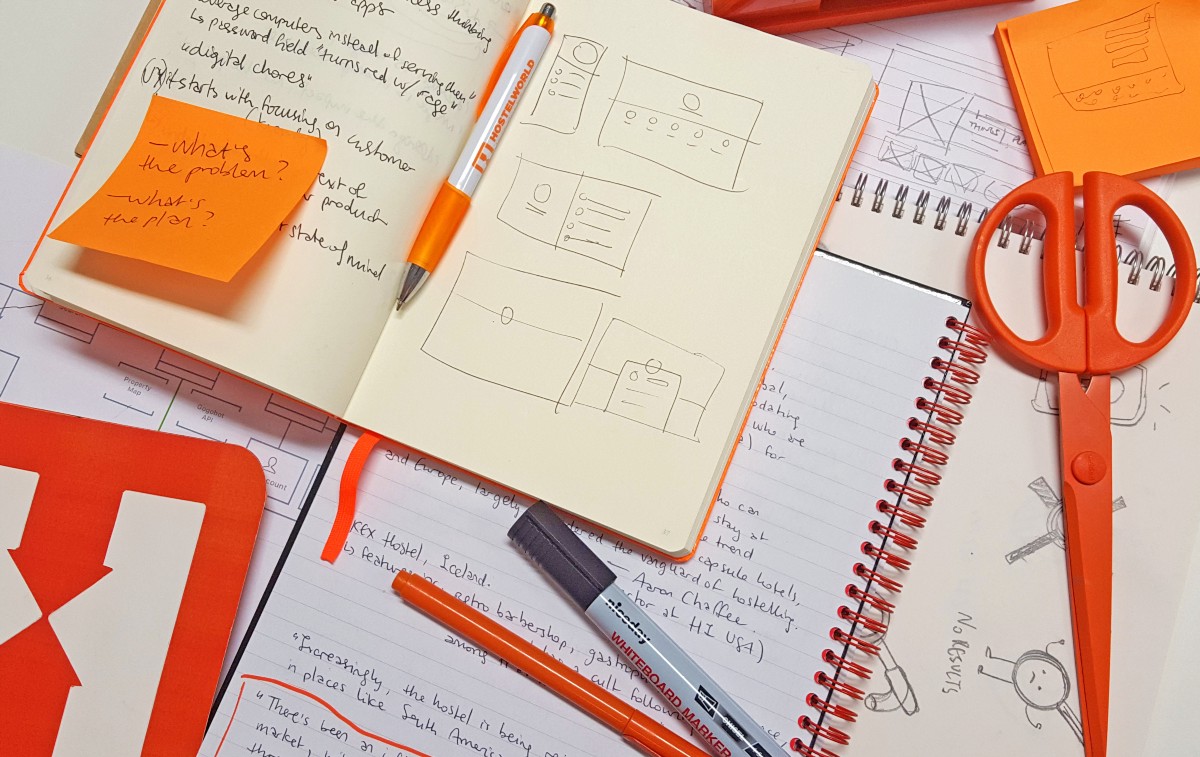
Yes, my desk is covered in orange stuff. And sketches, diagrams, notebooks, post-its, coffee stains and coloured markers.
My Expectations
Before I delve into the redesign, it’s worth mentioning how I expected the process to pan out. With a background in print, I had become accustomed to a certain working flow — research, mockup, refine, deliver. It seemed natural to me that product design would follow a similar pattern:
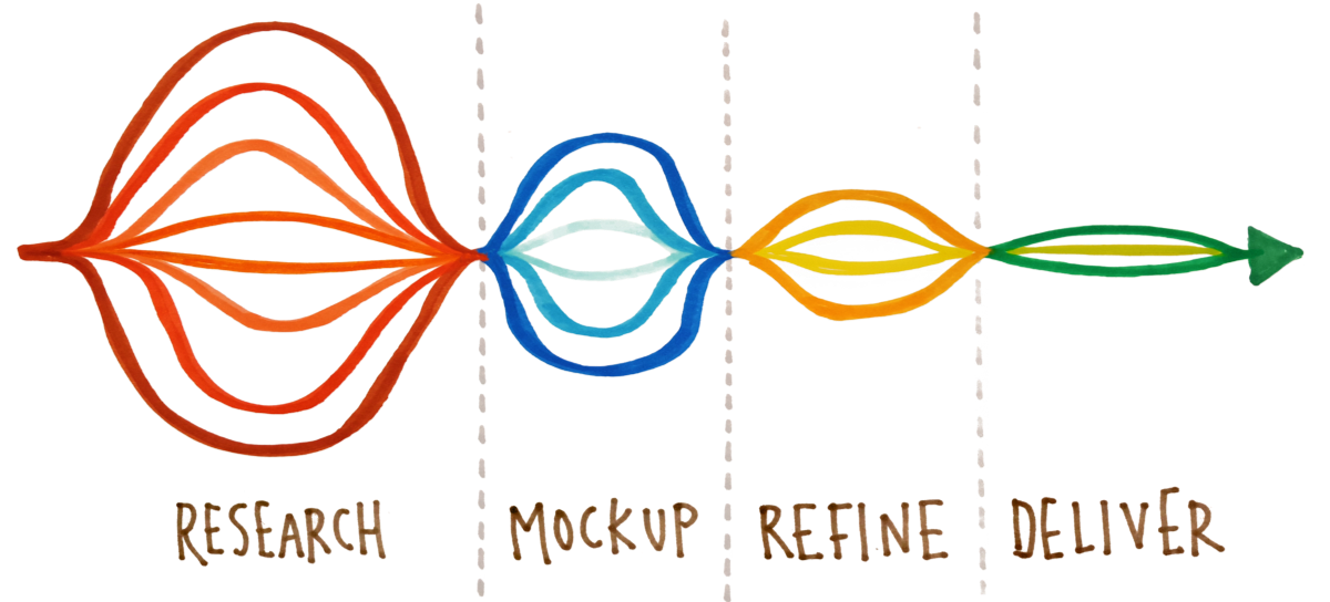
Fig.1 Simplified to some degree, but this was my experience of the print design process.
As I came to realise, the product design process is a little more complex:
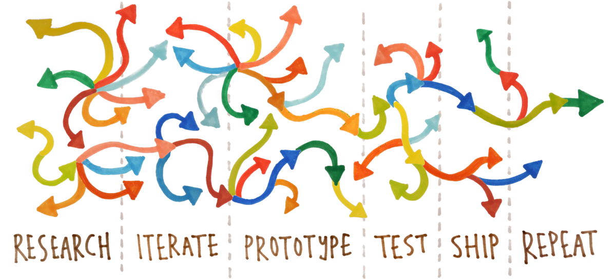
Fig.2 It might seem completely manic, but it’s a really effective way to design a product.
For the first couple of releases I was concerned I was doing something wrong. We seemed to be jumping back and forth between (what I perceived to be) sequential steps in the design process. No sooner than we were ready to ship a feature, we were back to researching alternative solutions. But this iterative cycle is where the most exciting design challenges emerge. There is no Send to Print equivalent in product design. I don’t pass my designs on to the developers and await the release. We work closely together at each step, along with a talented bunch of product managers, ironing out issues as they crop up. And trust me, they crop up. Have you ever played Whack-a-Mole? Product design can be a little like that.
Fig.3 “If we change them we’ll have to change this” … “But changing this breaks that” … “OK let’s leave that for now, and go with these” … “But how do these effect those?” …
With my preconceived notions of the design process shattered, I took to the web to find out more about product design, all the while absorbing everything I could from regular meetings with product managers, developers and an array of stakeholders. Dozens of release cycles later we’ve got an easy-to-use, beautiful (though I may be biased 😅) app with a material undercoat and a Hostelworld finish. It’s been an eye-opening journey, where I slipped up so many times it’s surprising we made any progress, so I thought I’d share a by no means exhaustive list of lessons learned designing my first mobile app. Though my experience was quite specific — designing a hostel booking app for Android users — I think these lessons apply more broadly to the product design process. Would love to hear your thoughts.
1. Question Everything
In the early days of my new role, I asked a lot of questions. What am I actually responsible for? What’s causing problems in our current build? What do people love and why? How would changing A effect B? Why does X work that way and Y another? Does anyone even use Z? You get the idea. Now people ask me these questions, and I can respond with clarity because I’ve asked them before, found answers, and investigated a number of alternative solutions. If I wasn’t asking questions early on I’d be stumped for answers and lose confidence in my work. And how can I expect others to see the value in my designs if I’m not sure about them myself?
The material specs provide detailed guidelines and abundant visual examples, but finding a balance between pure material design and the Hostelworld brand wasn’t a simple task. There were heaps of questions around what was technically possible, what our customers wanted, how the flow should feel and how we expected the app to develop going forward. I still ask these questions all the time and the answers are constantly changing (the joys of being a product designer during the ‘industrial revolution’!) so it’s important to keep questioning everything, find answers and then question those too.
Although I’m now a devoted Android user, before material design I flip-flopped between Android and Apple devices for several years, with no strong attachment to either platform. It’s reasonable to assume that in doing this I gained an innate sense of the patterns and quirks of each system, but actually figuring out how and why these patterns differed took interrogation, research, and relentless debates with our iOS team. So between the operating system, our app itself and the intricacies of the flow within it, I questioned everything. Early on I did it because it stimulated my interest and accelerated my learning but in retrospect I see how valuable this inquisitiveness is throughout the product design process.
2. Know Your Audience
During the rebrand, Hostelworld interviewed travellers around the world, conducted extensive surveys, and spoke with hostel owners about the experience our products provide. It was quite fortunate timing as it meant we had up-to-date statistics on our customers, their habits, painpoints and desires. I also sit neatly within Hostelworld’s demographic and always stay in hostels when I travel so I had some hypotheses of my own, though it’s important to mention that my assumptions were often completely wrong, bringing me back to the first lesson — question everything, even yourself.
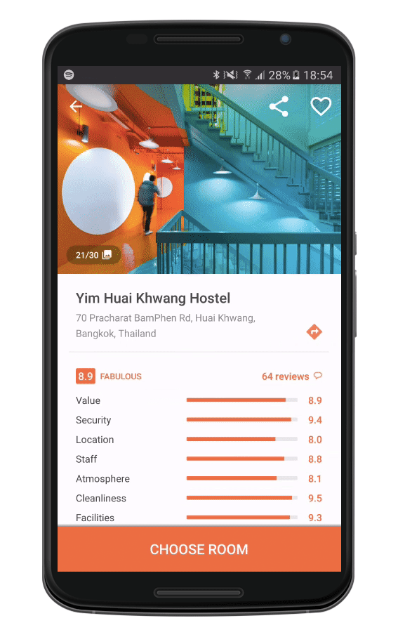
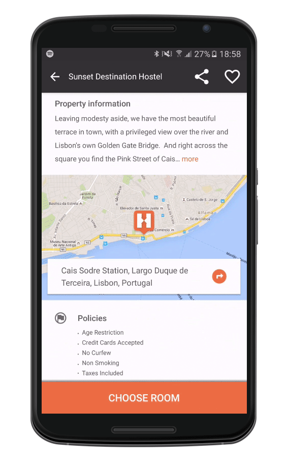
We knew that our customers chose hostels based primarily on photos, followed by price and then reviews. So these elements needed to be to the fore throughout the search UI. This tied in wonderfully with material design’s emphasis on large, immersive imagery and our hostels’ efforts to provide a high quality selection of property photos. In the property listings screen, each listing card needs to support a range of informational and interactive elements, so we removed visual clutter and made browsing for hostels as simple as swiping through a photo gallery.
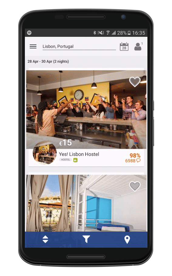
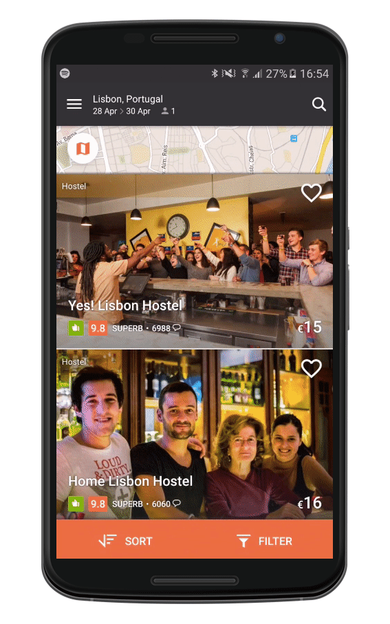
The property listings screen pre-rebrand was a little cluttered. Removing distractions made browsing for hostels clear and simple.
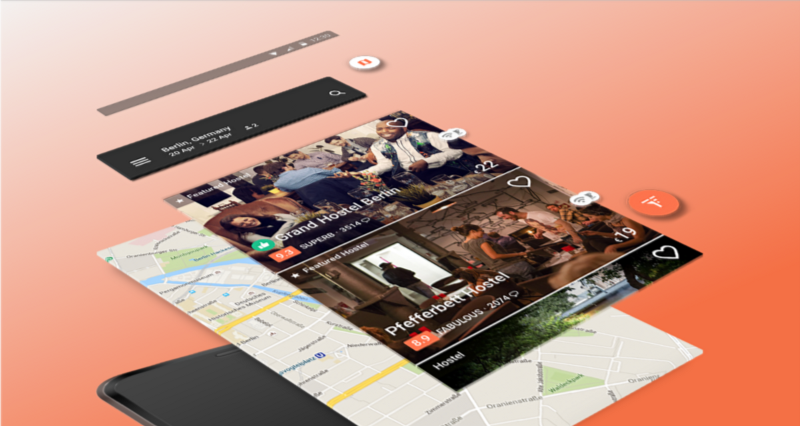
By 2015 most of Google’s apps were gleaming in material design, and it had started showing its face in third-party apps too. Characteristically material components were becoming system standards, and in an effort to keep the app feeling as intuitive as possible for our Android users, we wanted to adopt them where appropriate. Plus meeting rooms had a noticeably giddier air when we were discussing floating action buttons slurping and flinging, so it was fun to research and present potential designs using the material guidelines (incidentally, our property listings screen is known internally as the FAB or Find-A-Bed screen, which led to some confusing conversations around implementing FABs on the FAB 😵).
3. Know Your Team
I was fortunate enough to have a good support network internally at Hostelworld. Our amazing iOS designer Carlos Yllobre introduced me to his softwares of choice — Sketch, Marvel, Pixate and Zeplin — revealing his process from sketches through to prototypes, iterations and polished designs. We work closely and do our best to maintain consistency across the iOS and Android apps, while injecting some native goodness wherever we can. Our Android team is divided with product and design in Hostelworld HQ in Dublin and development in our London office. As a newbie to the technicalities of both the process and the platform, I learned a lot just by getting to know my team. The product managers showed me the roadmap, explained their process and the wide array of stakeholders they’d need to collaborate with to achieve all that it contained. I got to know the developers and the way they work through chat, calls, email and occasional visits. Learning how my team members worked helped to clarify my specific roles in the project.
I had naturally assumed design was of utmost importance, but design means nothing if the app doesn’t load, or the flow is broken. My initial Sketch files were littered with background imagery, blurs and fancy effects which looked lovely but provided little actual value. Working closely with my team we arrived at solutions that we knew were stable and scalable, and processes that weren’t unnecessarily intensive or cumbersome. If I didn’t know my team and the work they’re each responsible for, it would have been easy to assume that pushback on my designs was just the developers being lazy or the product managers not ‘getting it’. But knowing we’re all in the same boat, with the same objective in mind, I’m happy to take their advice and offer mine whenever possible.
4. Start Messy, Tidy as You Go
A week or so into the project we had our first design review and Carlos arrived with an impeccably produced prototype on his dazzling new iPhone 6+, blowing everyone away with pixel-perfect designs and delightful transitions. I mortifyingly presented some discoloured printouts (we were low on cyan that day 😳), labelled with coloured markers. Thankfully nobody seemed to mind, and besides, there was plenty to discuss before I began herding pixels into shape. I found it useful to work this way initially, perhaps because I was more comfortable with print, but it also helped determine the logical elevations of various components — a crucial element of material design.
Material design is guided by print-based elements, so it seemed logical to consider each component as a layer of paper.
I’m not suggesting that paper and pen are necessarily the best tools to begin with, but it’s important to cast a wide net before getting picky about details. Much of that first review was spent dissecting small details of Carlos’s prototype when there were deeper issues in need of discussion. At that stage of the process it was easier to analyse the way things worked rather than how they looked on printouts. I left the review with reams of feedback from an array of stakeholders and a much clearer understanding of how we could achieve our goals; Carlos left with a list of tweaks to make to his already immaculate designs.
I still sometimes work on paper (or whiteboards) but the bulk of my designing is done in Sketch. My first file is generally an explosion of artboards, the best of which make it to the second file and so on as they’re tidied gradually through successive sprints. This continues until I arrive at a solution worthy of prototyping when I tidy up the layers, flesh out the various states and start exporting. Perhaps it’s not the most elegant process but I find it very useful to tidy as I go. The design is likely to change somewhere down the line anyway (see Fig.2 above), so it’s helpful to have a bunch of pre-explored solutions to refer to when examining alternatives.
5. Prototypes Are Invaluable
They make everyone’s lives easier. They make it easier to check that your designs actually work before trying to get sign-off. They make product managers more comfortable approving screens because they can get a feel for them in context on a device. They help clarify how things work for developers, meaning your designs maintain fidelity as they’re converted to code. And they help testers compare expected and actual behaviour across a multitude of devices and versions. So all in all, they’re pretty invaluable. It took me a while to appreciate this, and I still struggle with building more complicated prototypes, but their advantages far outweigh any drawbacks so it’s worth investing the time it takes to create them.
How many words would it take to explain this toolbar animation? Prototypes are also useful for figuring out where certain actions surface (e.g. Street View on map).
During the ‘tangled in an explosion of artboards’ phase I use Marvel to quickly compare bunches of screens. It’s fast and simple to drop designs in and see how things look on a small screen, and really useful for narrowing down the best potential solutions to expand. For more refined designs, and to explore micro-interactions, animations and transitions I use Pixate, which is more complicated but still surprisingly intuitive, with seemingly limitless possibilities. When you’re done you can share a tappable prototype or export a video walkthrough — it’s so much simpler to explain how a toolbar animates or states transition in a five second clip than trying to put it into words. There are a host of other prototyping tools that we try out from time to time but I find myself returning to Marvel and Pixate the most.
6. Try It in German
The Hostelworld Android app supports thirteen languages, so every piece of text needs to be able to support a wide range of character counts. No matter how well something works in English, if the design breaks when it’s translated to Polish, French, Japanese, Russian etc, it gets scrapped. I often heard the phrase “try it in German” when presenting potential designs, and I think it’s a useful exercise regardless of whether your product is in German or not. It forces you to design with flexibility, which is great when you need to add or remove elements, as you inevitably will. Doing so also means I’m often paring designs back to their core, examining the hierarchy and the most helpful way to present it, which is easier to overlook when you’re busy keeping a perfectly harmonious layout in balance.
A wonderful article by Paul Adams on superficiality in product design mentions “the most important product design is usually the ugliest”. In other words your designs should be measured against your goals and plans, and the most effective solution should ship, regardless of how it looks. It’s easy to produce an immaculate design for a single artboard in Sketch — trust me I love doing it — but one of the most interesting challenges designing for Android lies in the sweeping range of device sizes and resolutions running the system. Flexibility is key, whether it’s in character count or the arrangement of elements and their behaviour as proportions and measurements adjust. If the design interrupts or confuses a customer who’s looking to book a bed, on any device in any language, then it’s not working. Trying your designs in several different languages forces you to think differently about how elements could be arranged, and so it’s worth doing.
7. Take It One Step at a Time
Due to the complex (chaotic?) product design process, the best way to get things pushed live is in small chunks. We’ve shipped a vast array of variations over the past year and a half, and though I was initially hesitant having work go out that wasn’t perfectly refined, the feedback we receive from real users is crucial when figuring out the way forward. Things often take a different direction to what we expect — people respond positively to a change we weren’t sure about, or ignore the feature we were sure they’d love — or a previously undetected bug emerges which effects the design, and the end result is a much better solution overall.
Our first release addressed one of the killer painpoints from our existing build — the search experience was somewhat confusing, which led to people inadvertently skipping steps and seeing irrelevant results. It’s important for customers to enter their checkin/out dates when searching, so we can provide them with up-to-date availability and pricing, which changes constantly. People were missing this step as it wasn’t obvious within the flow, and felt cheated when the prices they saw in their results didn’t match those at checkout. What we ended up shipping is really simple. Once you’ve entered your destination, the toolbar extends to reveal your checkin/out days. Edit as desired and tap Search (we couldn’t not use a FAB!).
Tiny icons meant users were unintentionally skipping fields in the old search flow. The redesign made it super clear what information was needed to run a search.
This was a reasonably substantial change to one of the most important functions in the app. But we knew the existing build was creating confusion, and we had tested the new version internally with good results. The first version to go live was a little rough around the edges, but it achieved its goals and even surpassed expectations, inspiring confidence for the next step in the material design project. Had I spent more time refining the designs the results would have been the same, it just would have taken longer to receive them. It was comforting to read positive reviews of the new design, and see that literally nobody noticed that the text was a few pixels off-kilter (although I still made sure it was adjusted in a cleanup release 👼).
8. Pull Your Weight
This isn’t quite a lesson learned — it’s Teamwork 101 really — but pulling your weight leads to a more successful product. It’s easy when you have heaps of deliverables so you’re kept on your toes, but it’s when things are quiet that doing your share has an even bigger impact. I harness my downtime in different ways depending on what stage we’re at or what’s coming up, but I generally read a lot, tidy up my files or plan for impending changes, explore completely different solutions to problems we’re facing, dip into the iOS HIG for a look around, and offer design support on completely different projects from internal communications to marketing campaigns.
Getting away from the product design process, even briefly, can be helpful to refresh your thinking. If I’m ever stuck on a problem, having explored heaps of problematic designs, a day or two away from it sheds a new light when I return. We’re fortunate at Hostelworld to have small (dare I say agile) teams across the company who are eager for design support in some capacity. If I’m going through a quiet patch in Android, there’s always an email campaign worth recoding, or some slides that need polishing. While I’m busy elsewhere, I’m subconsciously analysing my existing explorations and before I know it I’ve imagined a whole new potential solution. Taking advantage of your downtime gives you a chance to exercise more creative muscles, and leads to better design across the board.
9. Test Relentlessly
Each feature undergoes thorough scrutinisation across a multitude of devices before being shipped. Everything gets tested in each language we support through a wide range of use cases according to the product requirements. As our customer base is likely travelling, we conduct impaired connectivity tests to ensure things still work on shoddy WiFi. The results of the tests can often impact the design as unfathomable issues arise on the tiniest Samsung or the biggest Nexus, sparking ideas for slight adjustments which could improve the structure across all devices. Though I saw them as something of a headache initially, I’ve come to embrace the testing cycle as a means to improve the flexibility of my designs.
One of my college lecturers used to regularly quote Samuel Beckett: “Ever tried. Ever failed. No matter. Try again. Fail again. Fail better.” It’s always stuck with me because I seem to be perpetually failing better. But as I’ve tested my own work I’ve honed my design sensibilities, and find that previous failures are 🔑 to future successes. Nowadays I find myself navigating flows in my head and spotting problems with the layouts as I’m imagining them—certain things have become instinctual and I naturally avoid pitfalls while exploring solutions. If my work wasn’t being tested relentlessly, from my initial litmus tests to the complete inspection, problems would be harder to solve and any solutions I’d come up with would likely just add more complications to the mix.
10. Do It All Again
Of all the post-its and clippings of drawings and notes that litter my monitor, there’s one that always catches my eye — a famous Bertrand Russell quote: “It’s a healthy thing now and then to hang a question mark on the things you have long taken for granted.” The constant feedback we receive from customers shapes how the app develops in the future, and so we’re never really finished. Juggling business goals with material’s evolving specs and feature requests from users is a challenge, but a thrilling one. If I’m designing a part of the app we haven’t touched in a while, I often find myself wondering how on earth we ended up shipping what we did. I’ll spot flaws in the design which I’d never let slide today — an icon that looks out of place or dividing lines serving no purpose at all.
Doing it all again is a humbling process. Starting from scratch — questioning everything — revisiting designs you thought were perfect and seeing elementary issues you forgot you struggled with only months ago, is a whole series of lessons in itself. Priorities change, objectives alter and trends fade, and when you’re back to step one you’ll have new sets of deliverables, and new perspectives on how to achieve them. All that’s really set in stone is your ultimate goal — in my case it’s helping people book hostels — the rest is so changeable that you’ll have to do it all a few times before you can make an informed decision anyway. Next time you’re redesigning your own designs see it as a learning opportunity, it’s probably the most valuable lesson of all. Don’t see it as a failure. Or do, just fail better next time.
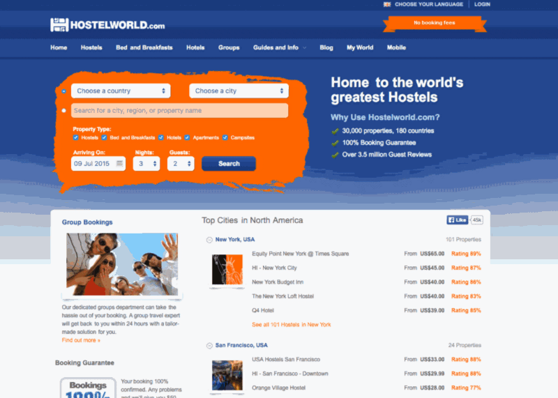
Hostelworld’s Android efforts have multiplied since May 2011 when we launched a hybrid mobile app, which paved the way for our first native app in August 2014. The first release of the material redesign was back in May 2015, and the full version launched about a year later. Along the way we were awarded Editors’ Choice by Google in the Play Store, and our dev team deservedly earned ‘Top Developer’ status for their dedication to the platform. If you’re running Android you can get the app here.