It all makes sense in retrospect—since I was young I’ve enjoyed reading, writing, drawing words, making letters, learning languages, inventing portmanteaus—but it was only in college that I realised, all along it was typography that I loved. I amassed a heap of books on type and design and with every page turned my interest flourished.
So imagine my delight…
The opening line of this brief was “It is essential that you demonstrate rigorous attention to typographic detail”—already I was bursting with excitement. This was the perfect opportunity to delve deep into my bookshelves and really explore this delightful craft. The task was to typographically interpret samples from a collection of sound clips recorded in mid-century, rural Britain.
The Survey of English Dialects interviewed farmers for their distinct accents, which were often thick and sprinkled with colloquial expressions. It occurred to me that the words and phrases spoken in these clips would rarely, if ever, exist in physical form; rather they would only ever be delivered through word of mouth. This was an opportunity to convey something intangible, something we would never normally see, using paper and ink.
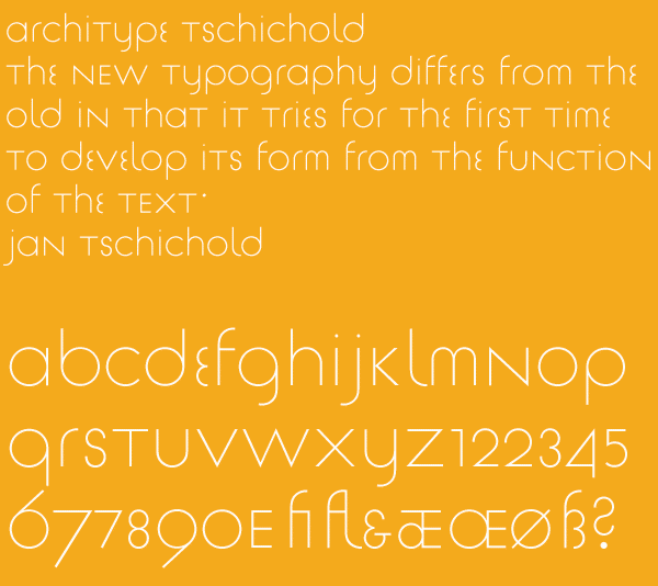
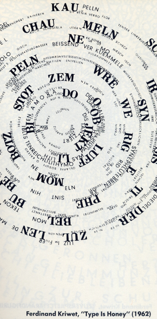
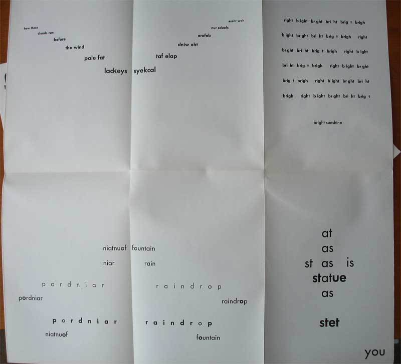
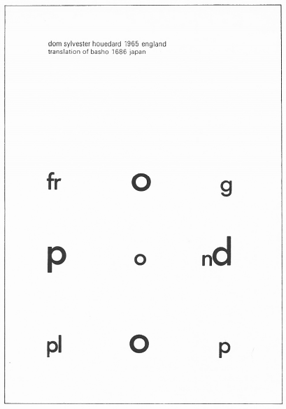
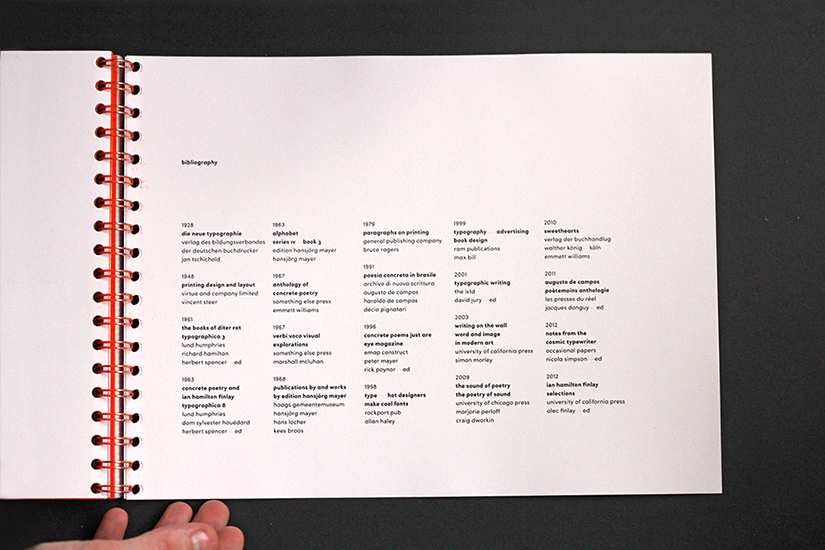
In a stroke of fortune, I got my hands on some rare editions of a British magazine from the sixties called Typographica, and while poring over the pages I unearthed a treasure trove of typographic ingenuity called concrete poetry. This was an artistic innovation which was proliferating at the time, and contained in one of the magazines was the first essay published in England on the movement, which endeavoured to convey the human element of a typographic arrangement.
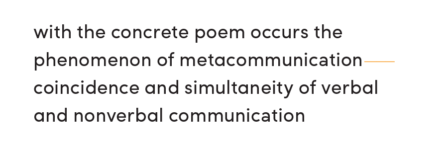
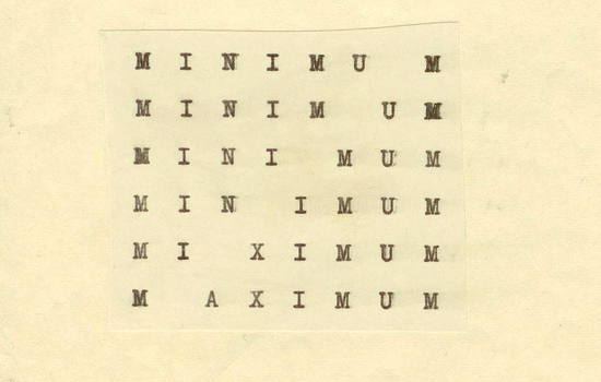
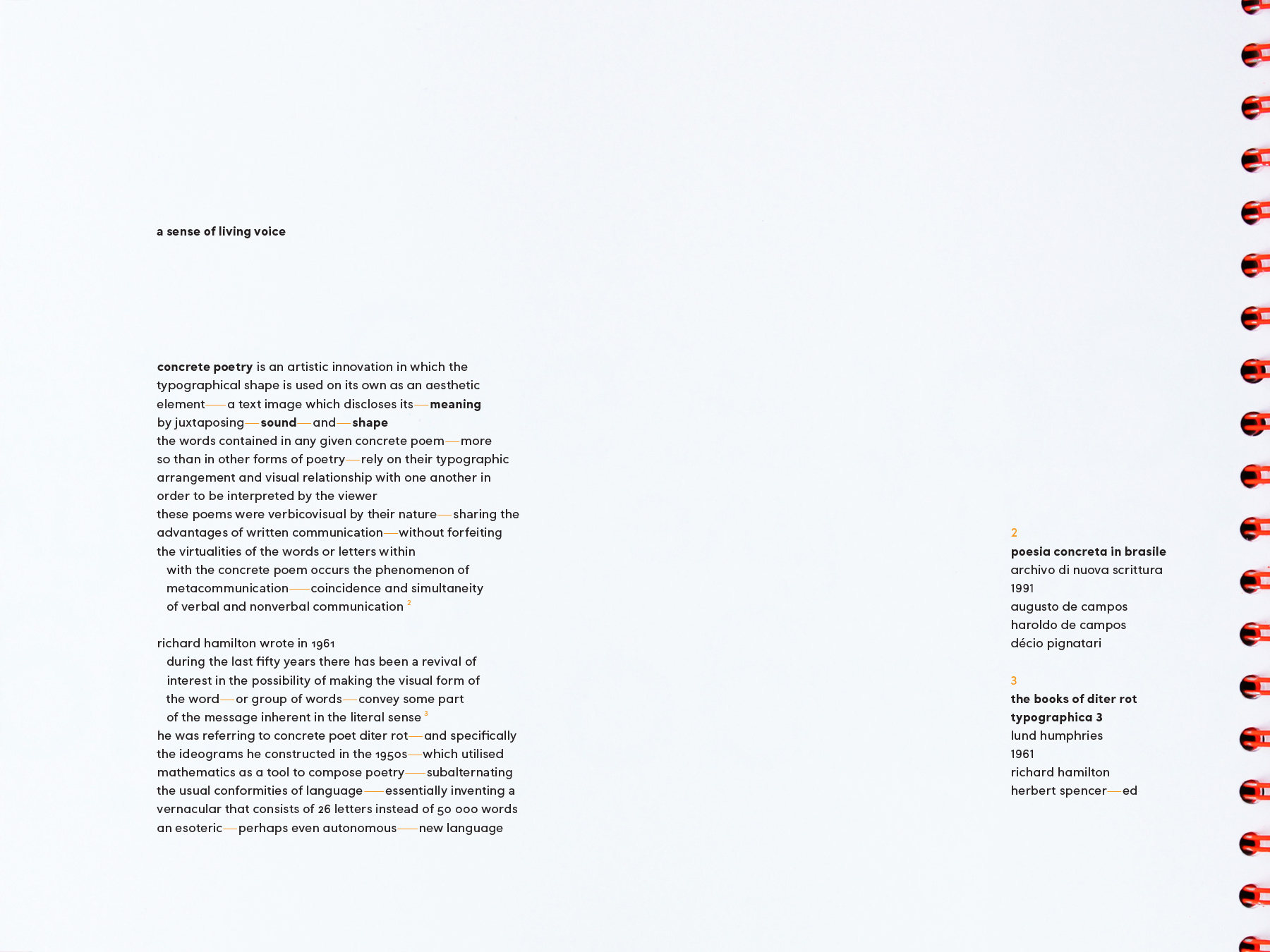
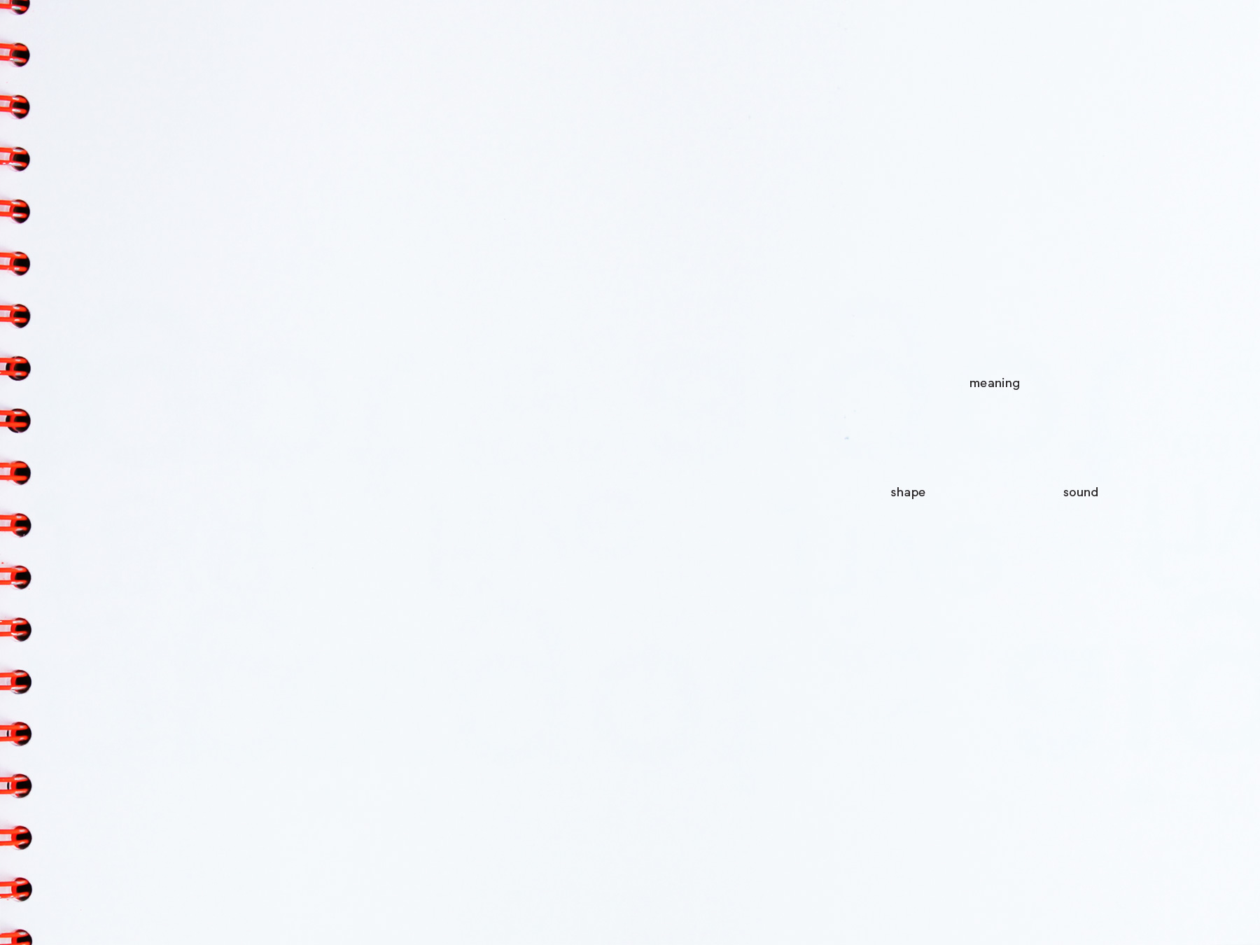
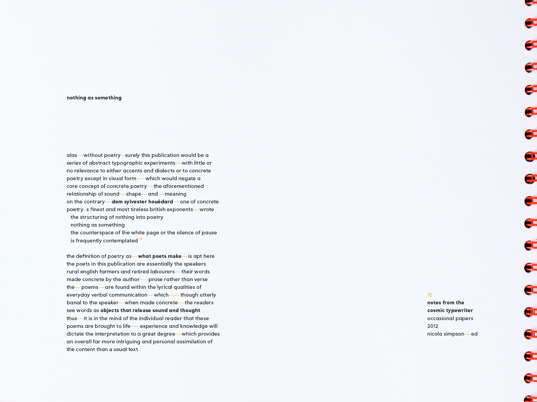
This piqued my interest, and I gathered as many references as I could find on the topic. Definitions were varied, but in a nutshell, concrete poetry is a form of poetry in which its typographical arrangement adds meaning to the poem. Or, in a more philosophical nutshell, as written by concrete poet Dom Sylvester Houédard in ’63: “Every word an abstract painting, read quickly in a phrase words get lost. In concrete, eye sees words as objects that release sound/thought echoes in reader [sic]”. This was a goldmine. The more I dug, the more fascinating examples of concrete poetry I discovered, and the more apparent it became that this was the ideal medium to interpret accents using type.
A sense of living voice
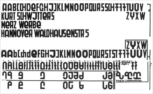
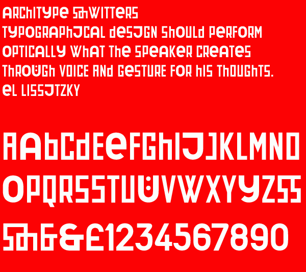
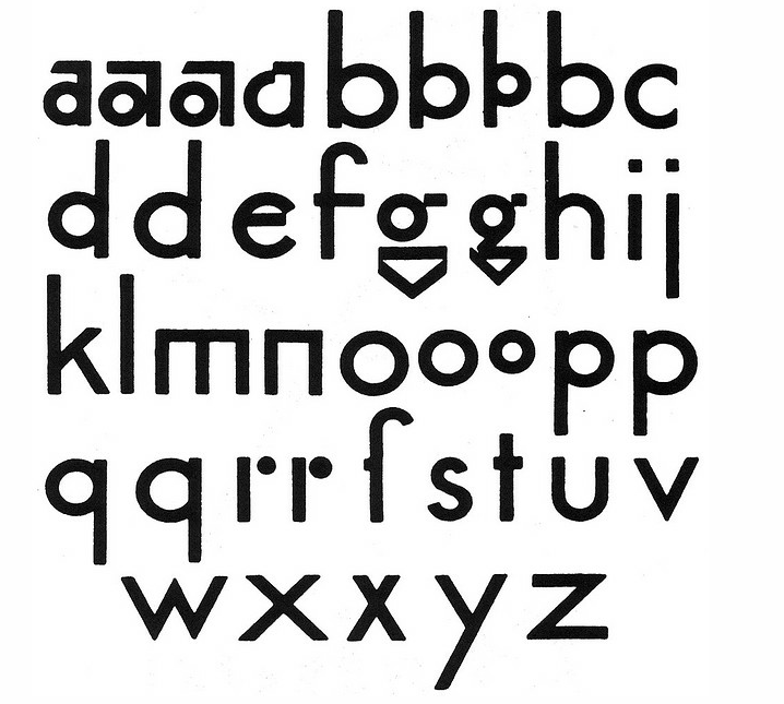
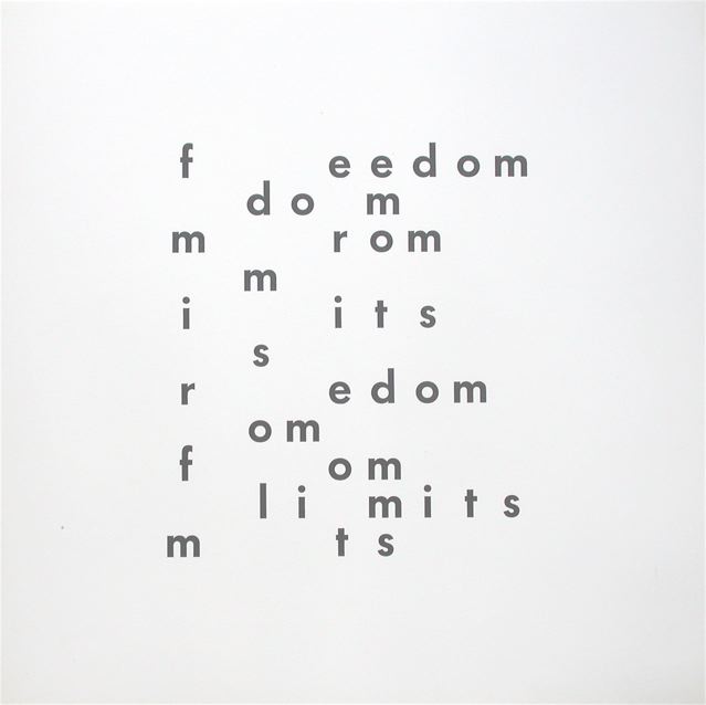
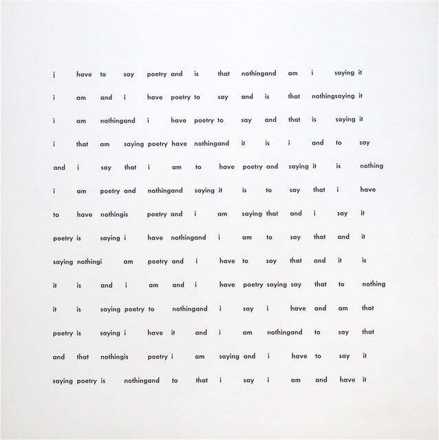
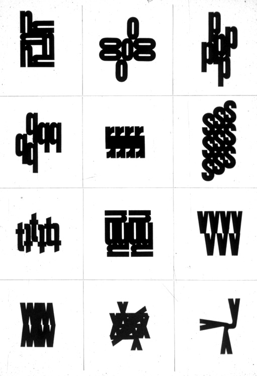
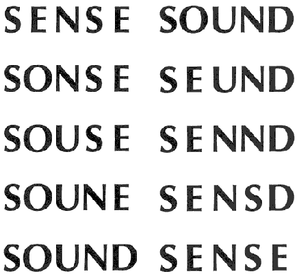
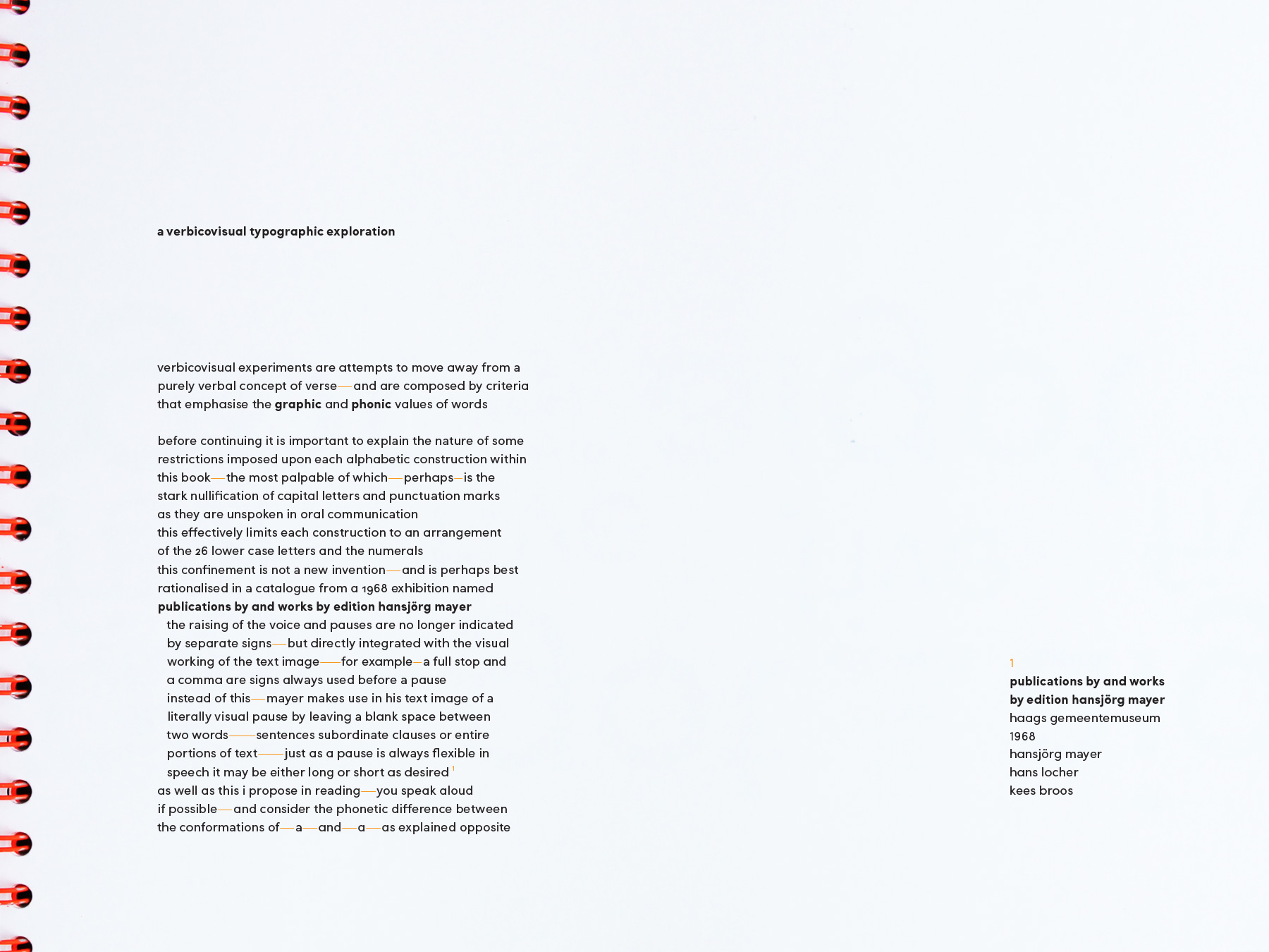
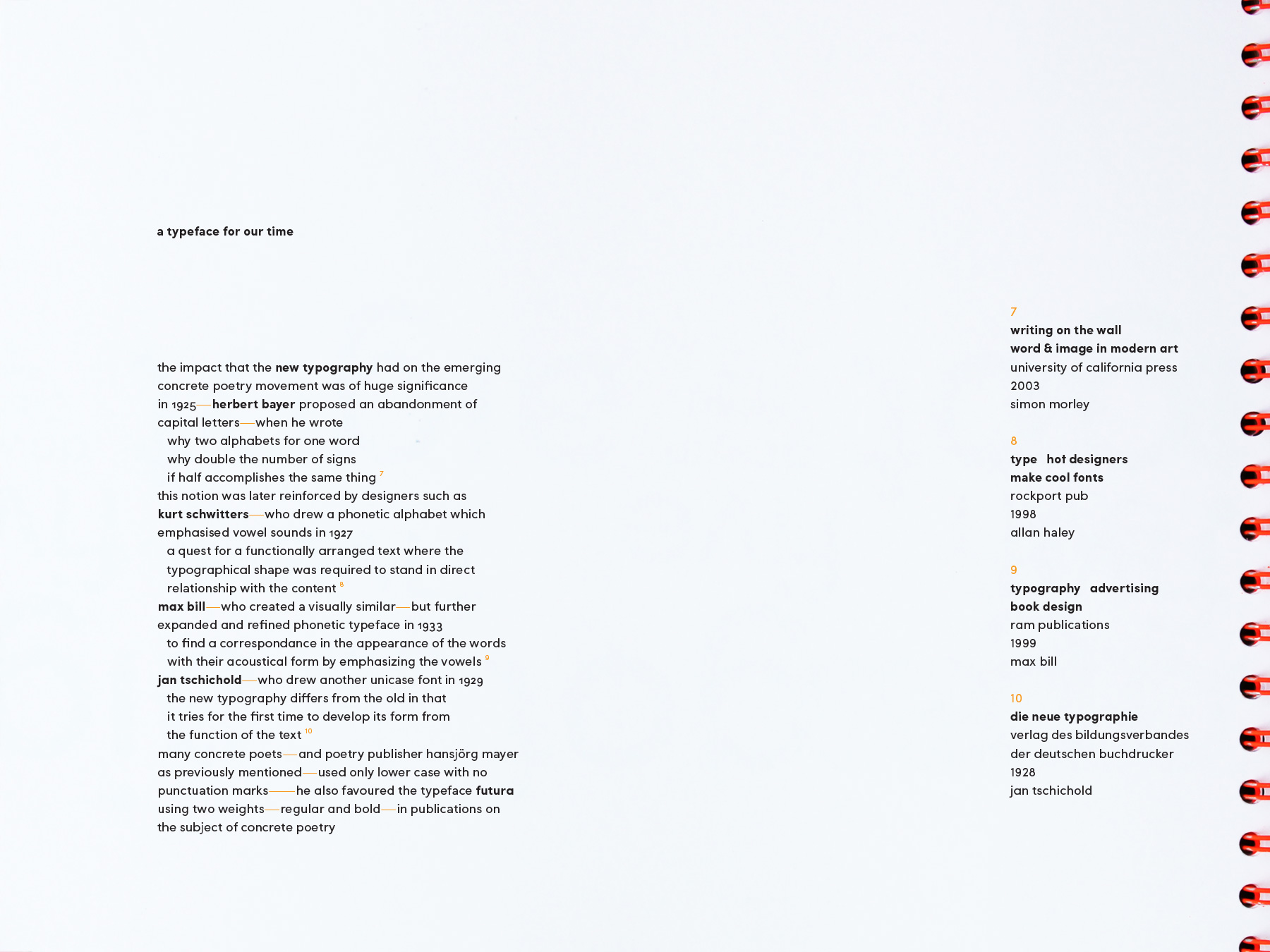
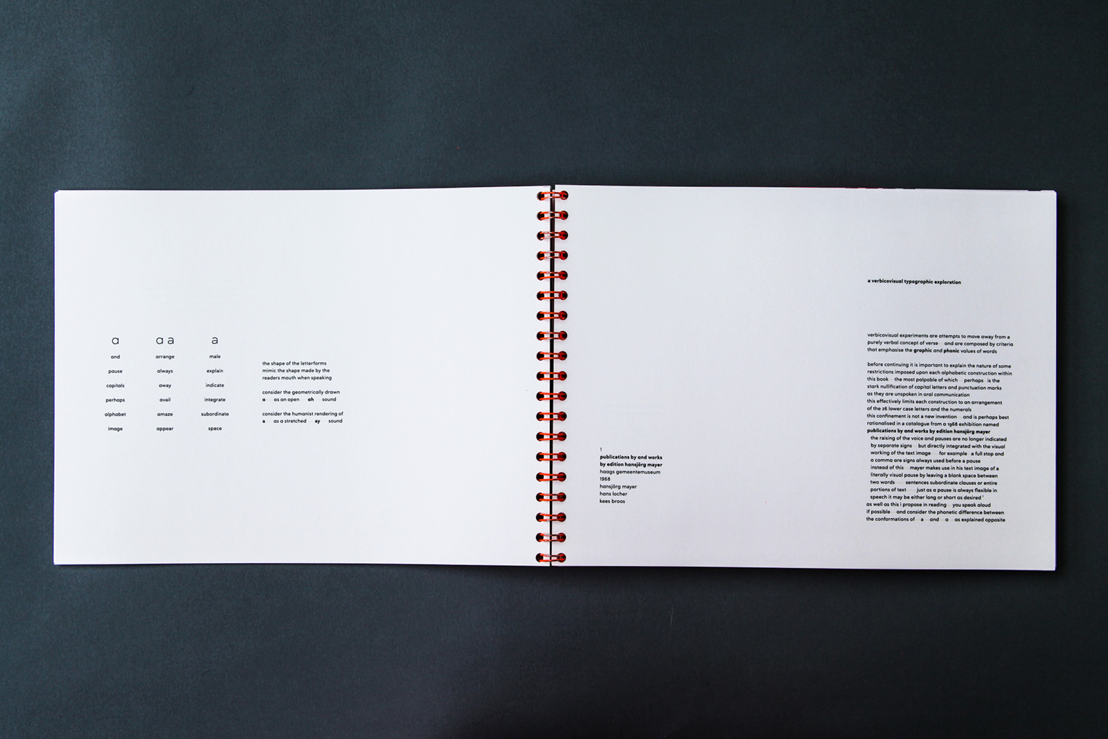
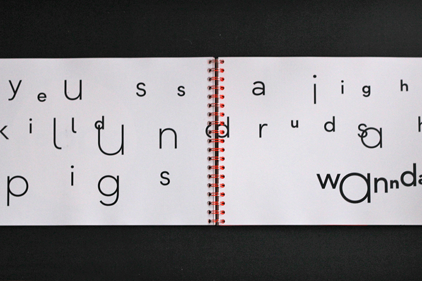
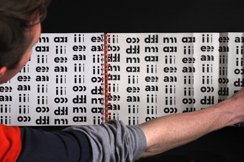
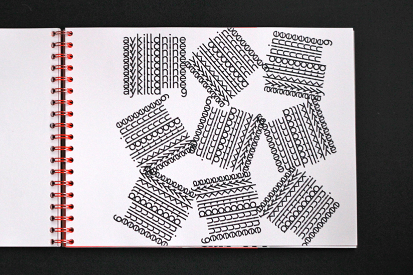
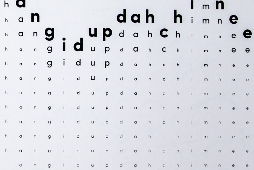
Many concrete poets developed rules for their writing, in a quest to more closely coordinate the optical structure of the printed word with the phonetic structure of speech. Some embraced a complete abandonment of capital letters and punctuation marks, declaring them frivolous—they are not spoken, so why should they be written? Others invented new alphabets, giving visual emphasis to letters which would typically contain verbal emphasis.
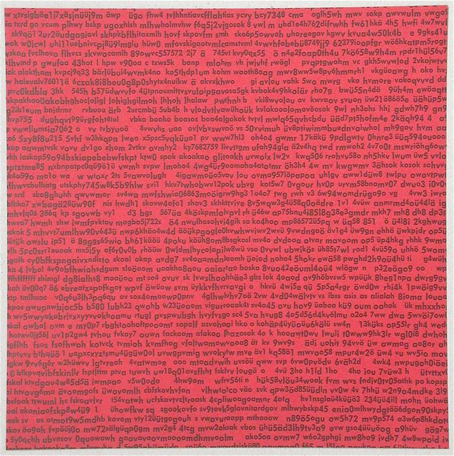
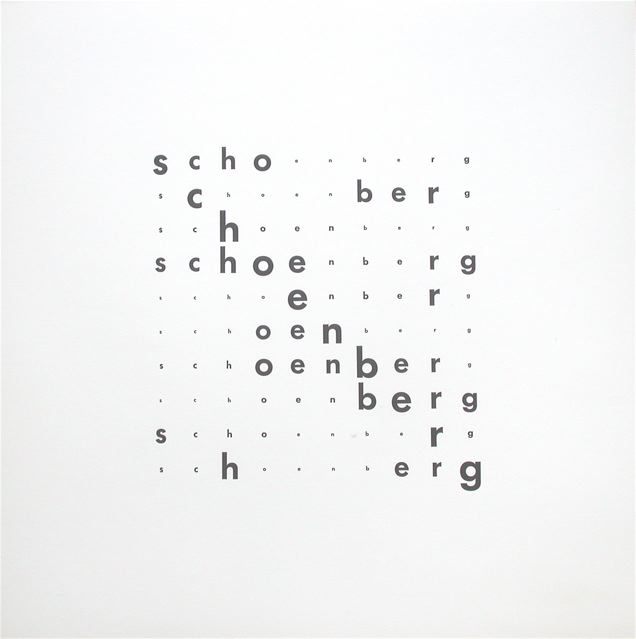
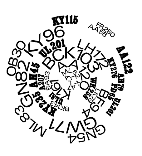
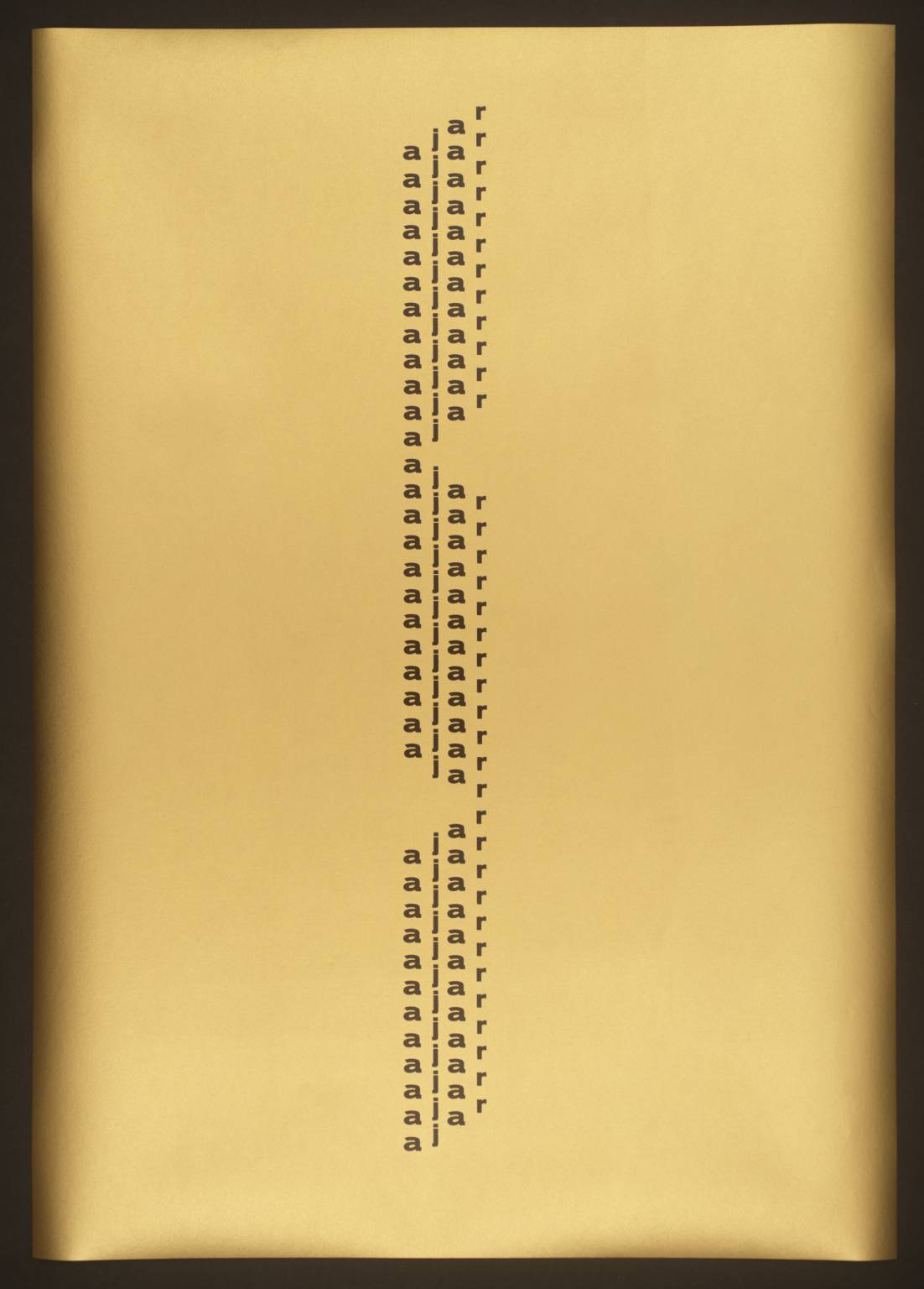
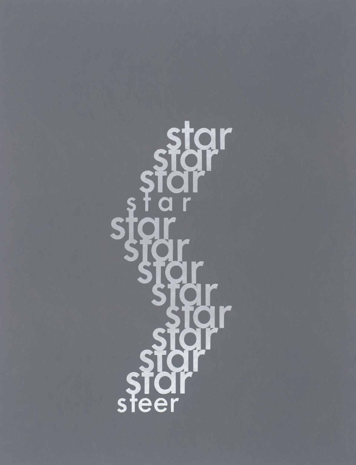
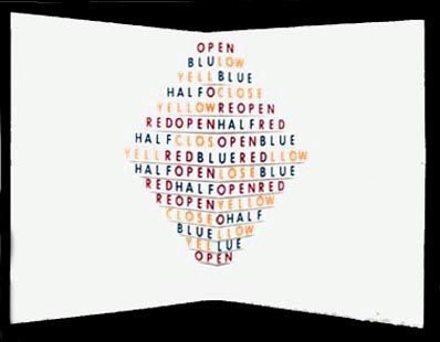
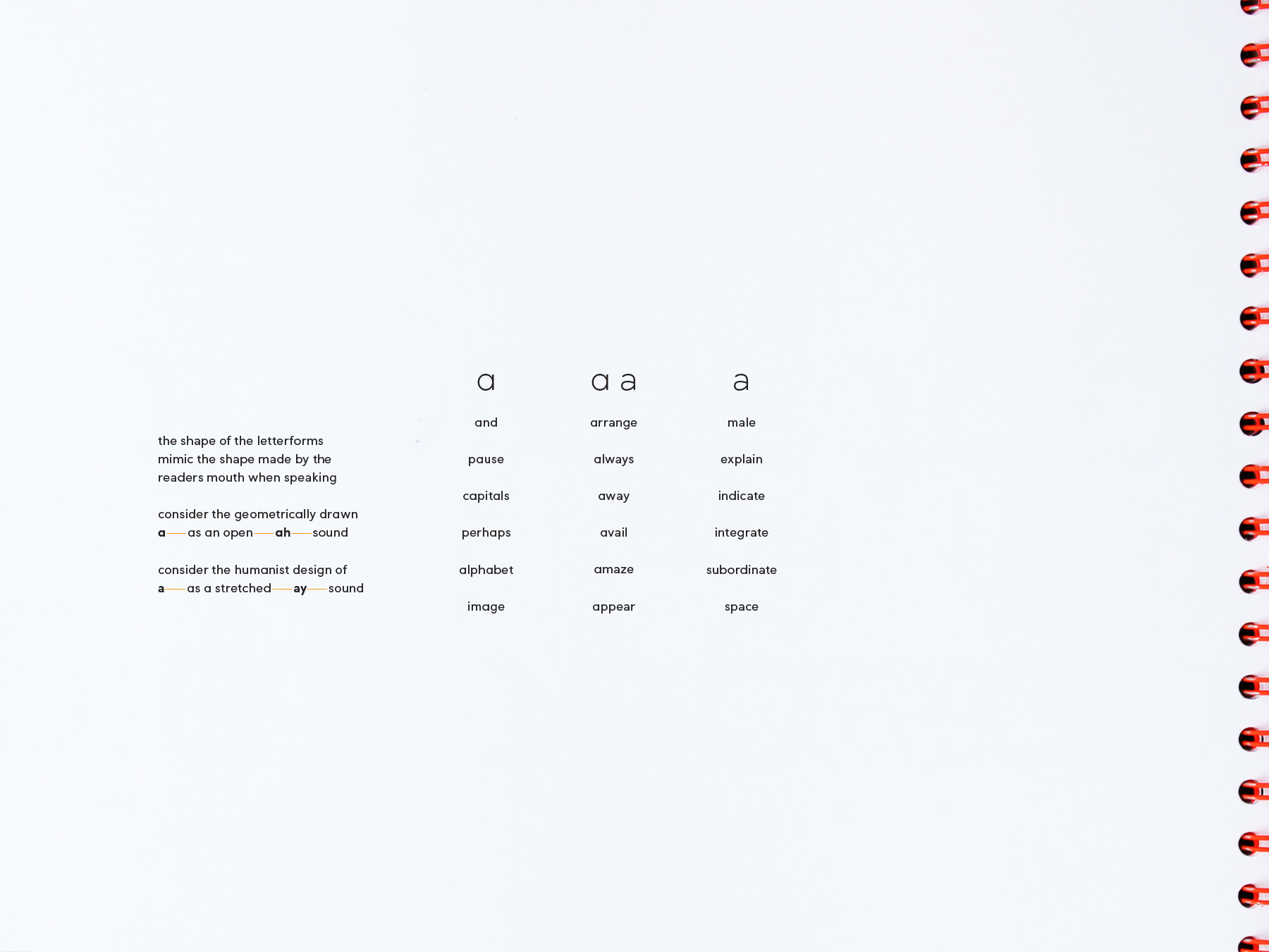
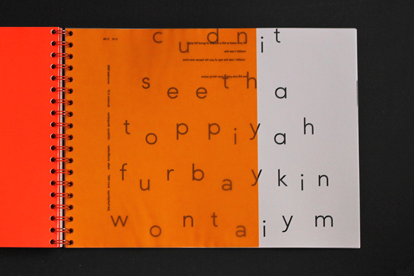
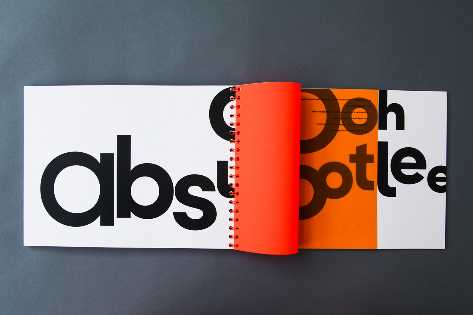
I decided to adopt some of these rules and apply them to my own ‘poems’ (the sound clips I had selected to interpret). I restricted them to one colour, using only the twenty-six lowercase letters and ten numerals, and I used different conformations of the letter a to represent different sounds made while reading. These typographic constrictions allowed the interpretations of the sound clips to be more easily understood, emphasising the aural distinction between ah and ay sounds.
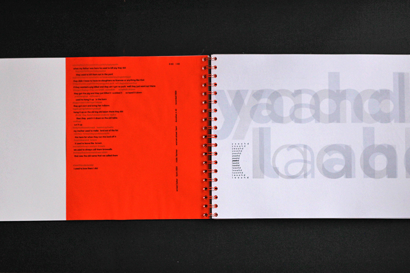
I set about transcribing the sound clips I had chosen to interpret, which were recorded in farmers’ homes and contained accents from Northumberland to Kent. This produced some very interesting results, with phrases like tenner a pound becoming tannerihpowynd. The next step was translating these transcriptions into legible English, so their dialectal delivery could be considered alongside their literal meaning.

Once I had enough transcriptions and their accompanying translations, I extracted phrases and sentences to interpret using concrete poetry. At this stage, I had such an amount of research compiled that it only seemed logical to write an essay to accompany these poems. Applying the same typographic constrictions to a larger body of text proved challenging, but the result is actually quite an enjoyable read (best read aloud in fact):
Prose rather than Verse
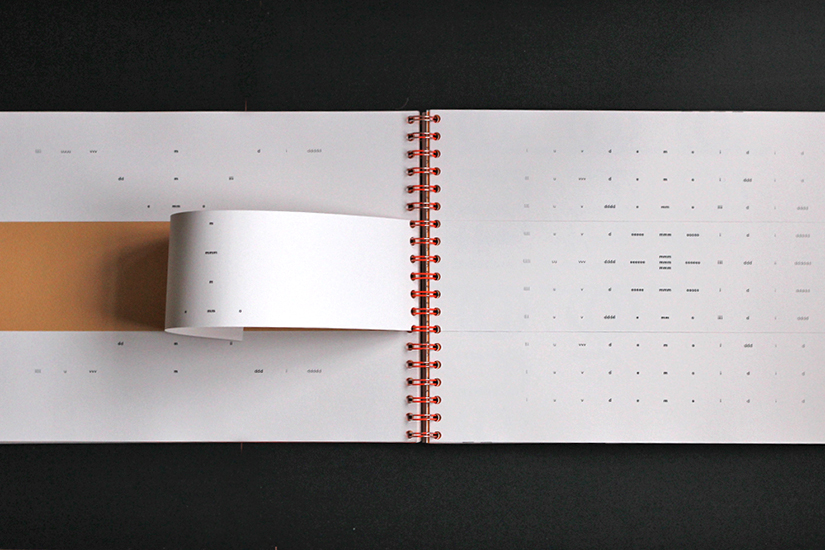
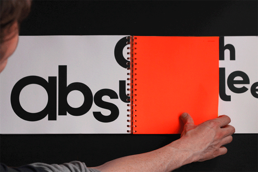
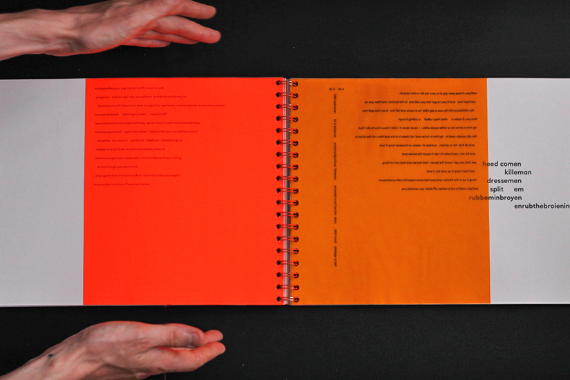
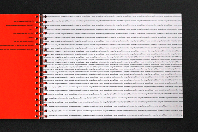
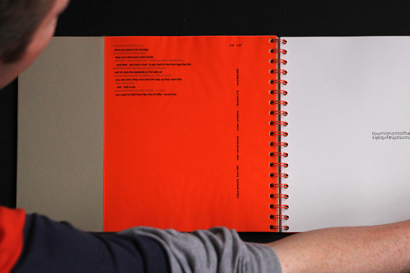
I categorised each accent, detailing all available information about the interviewee, and adding the transcription and translation of their conversations. I printed the transcriptions on fluorescent orange paper, and the translations on translucent orange paper, so as the pages turned, the texts merged. The orange pages acted as dividers between accents, while their contents produced unexpected typographic arrangements as the reader moved through the book.
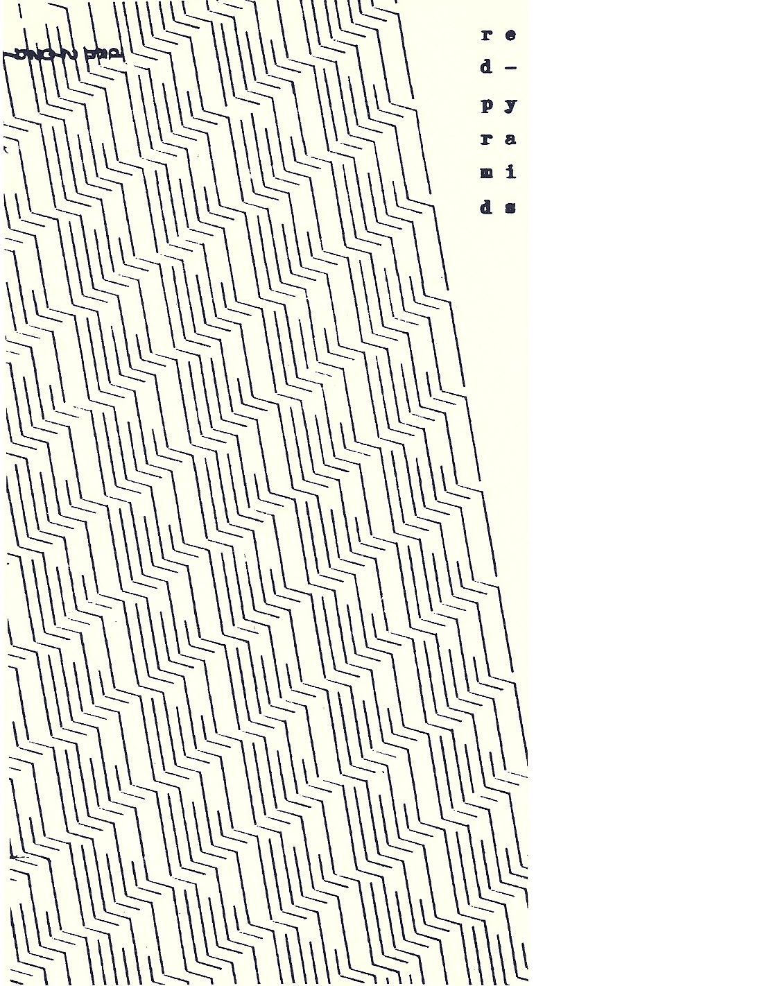
Text as image
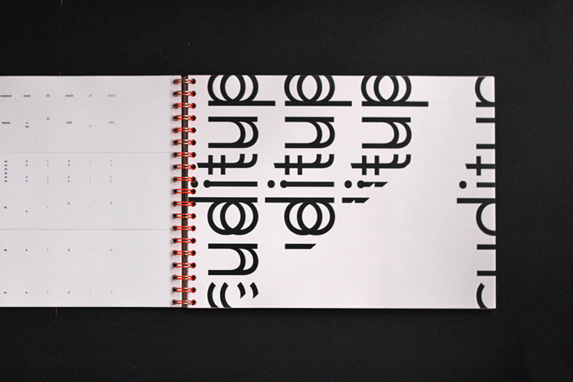
It was in the typographic interpretations however, that the book really came to life. Bold, loud voices were given bold, loud typographic treatments, while recording quality was reflected in the paper stocks, with cut paper representing disjointed interviews and coarse paper used when recordings contained a lot of static noise. This was also a great chance to indulge the print nerd in myself, and throughout the project I jammed more printers with unusual stocks than I can count on both hands.
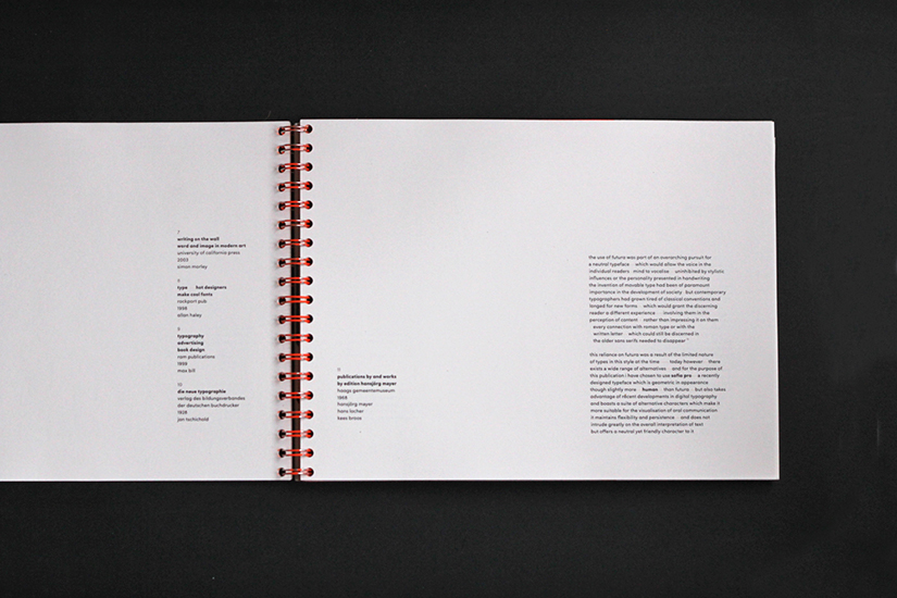
The finished outcome was a large format, spiral bound book, which contained the introductory essay followed by about eighty pages of typographic interpretations.
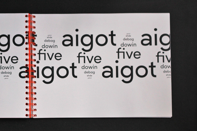
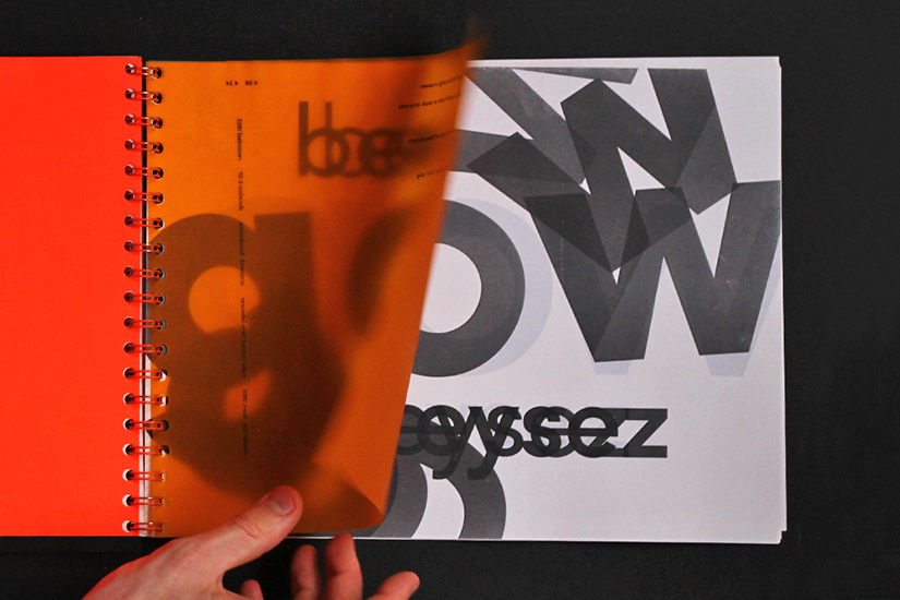
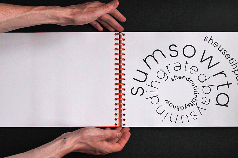
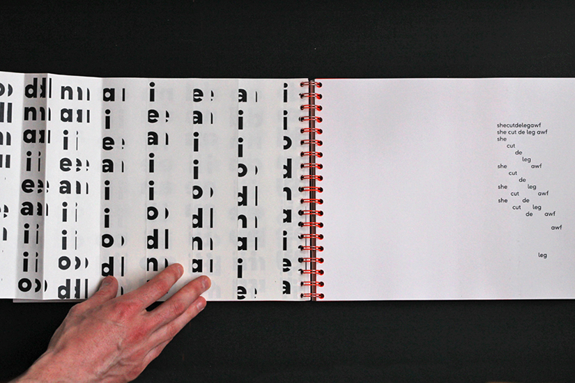
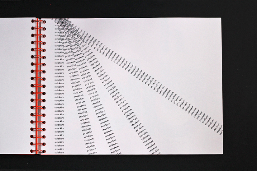
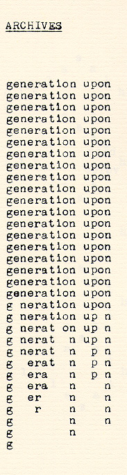
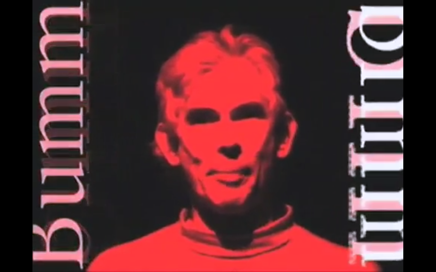
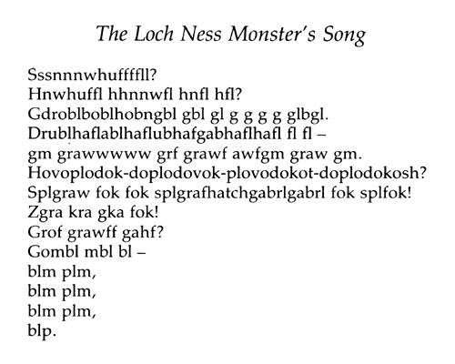
Loud voices were interpreted with loud typographic treatments.
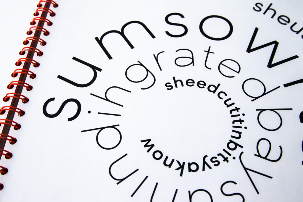
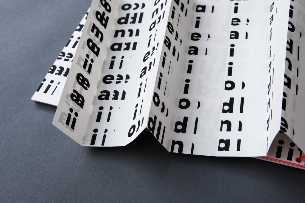
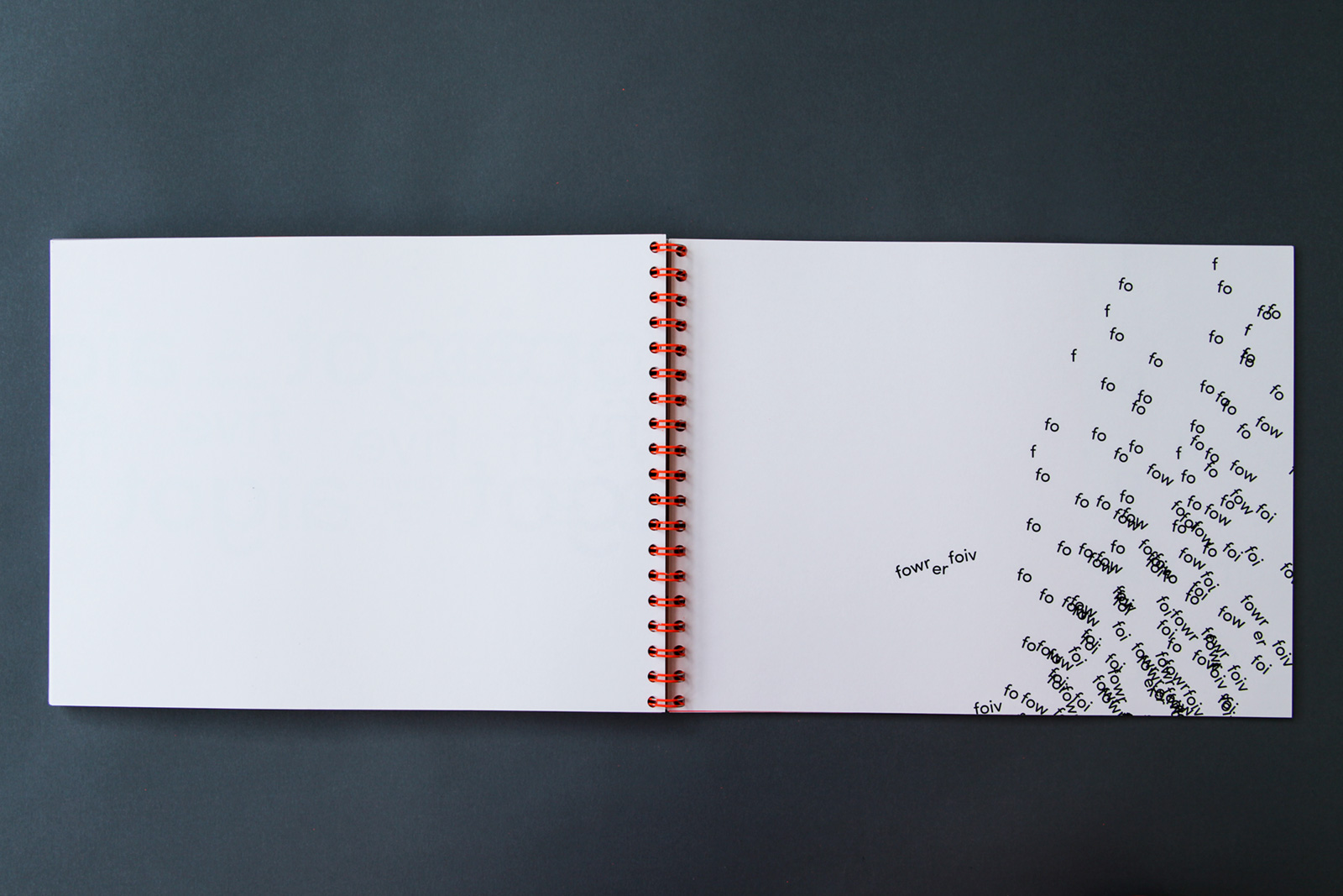
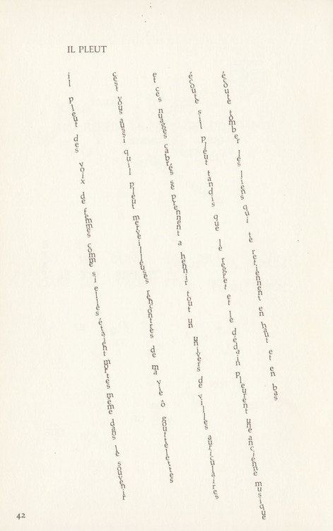
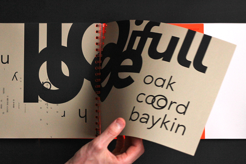
This interpretation reflects both the interviewee’s stutter and the broken recording.
This was a nine week project in total, and I spent at least seven of those weeks engrossed in research, before actually tackling any typographic interpretations. I’d always considered research an integral component of each project, but this brief opened my eyes to the value it can add to the entire process. It helped of course (or maybe it was inevitable?) that I became utterly obsessed with concrete poetry and printing materials during the project. Hope you enjoyed this case study!
Want to see some references? Click here